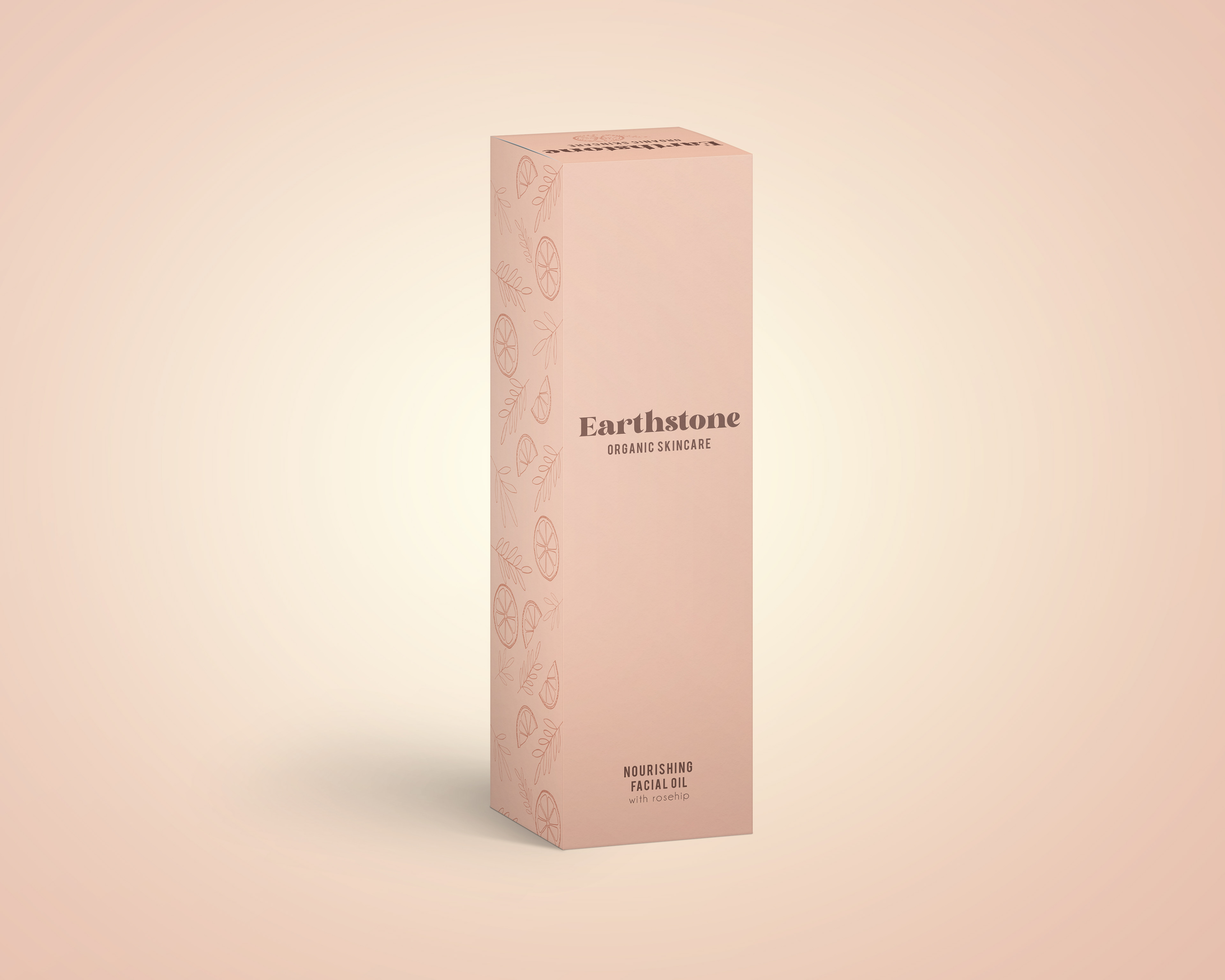
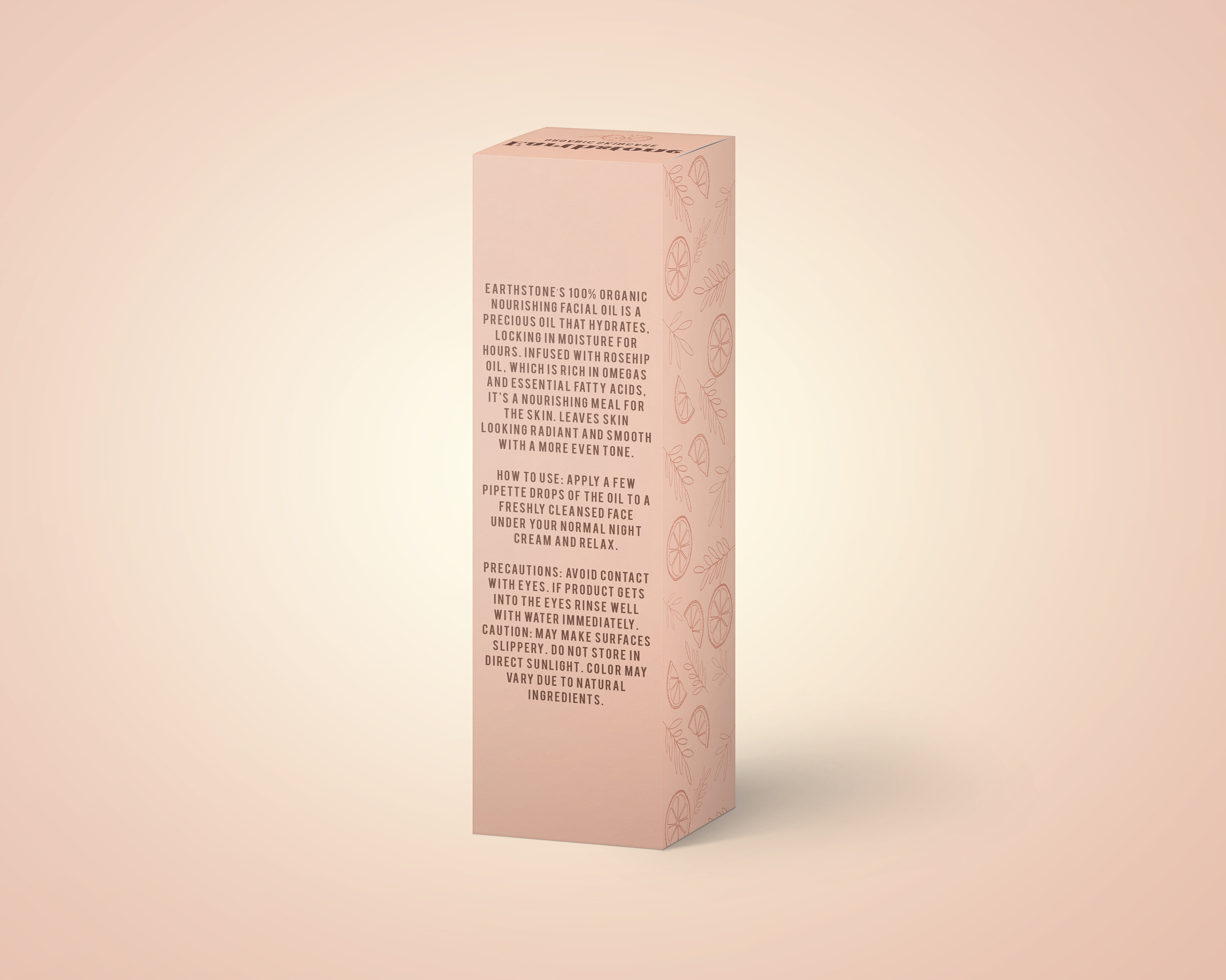
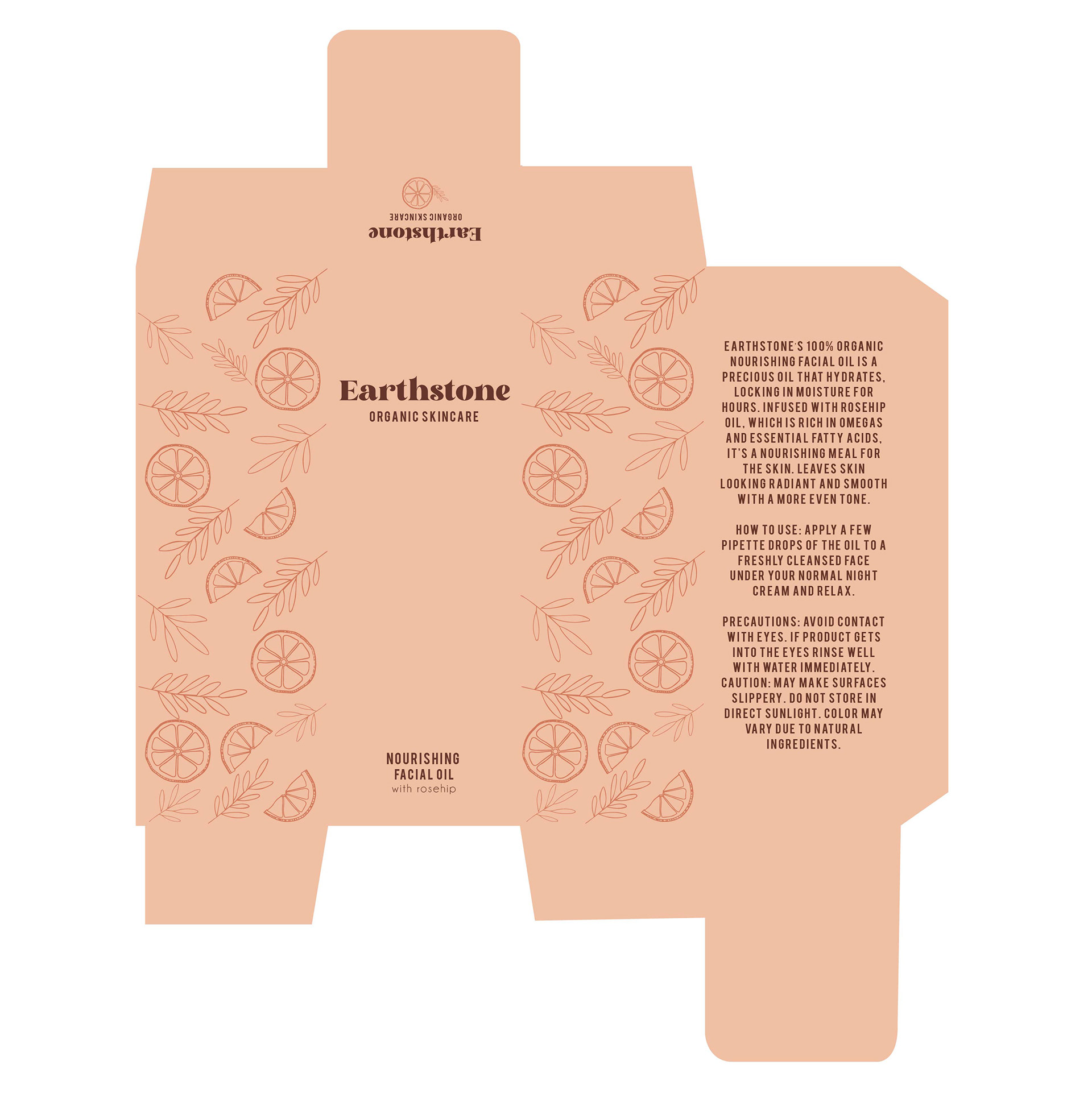
This packaging was inspired by all natural skincare. The skincare industry is really growing and I wanted to use natural products on the packaging as well as natural colors to show the naturally derived ingredients.
The honeycomb design of this packaging was meant to be a clean and simplistic style to attract consumers. The color scheme of the packaging is meant to match the color of the honey, and the labeling offers a simple yet enticing option that will “pop” on store shelves.